Components
Components list
Accordion
A vertically stacked set of interactive headings that each reveal a section of content.
Alert dialog
A modal dialog that interrupts the user with important information requiring immediate attention or action.

Alert
Display alert messages with different variants and optional icons.

Avatar
Display user profile images with fallback support for missing images.
Badge
Display a badge with different variants and styles.
Button group
A container that groups related buttons together with consistent styling.
Button
Render a buttons/link with optional icons (prefix, suffix, both).
Card
Display content in a card layout with header, content, and footer sections.
Dialog
A dialog is an overlay shown above other content in an application.
Drawer
A sliding panel component that appears from the edges of the screen.
Dropdown menu
A dropdown menu displays a list of actions or options when triggered by a button.

Field
Build accessible forms with field validation, labels, descriptions, and error handling.
Form
Complete Symfony form theme using HarmonyUI components for inputs, selects, buttons, and field layouts.

Input group
Displays supplementary information or interactive elements alongside input fields or textareas.

Input
Text input field with validation states and focus styling.

Label
Accessible label component for form inputs.
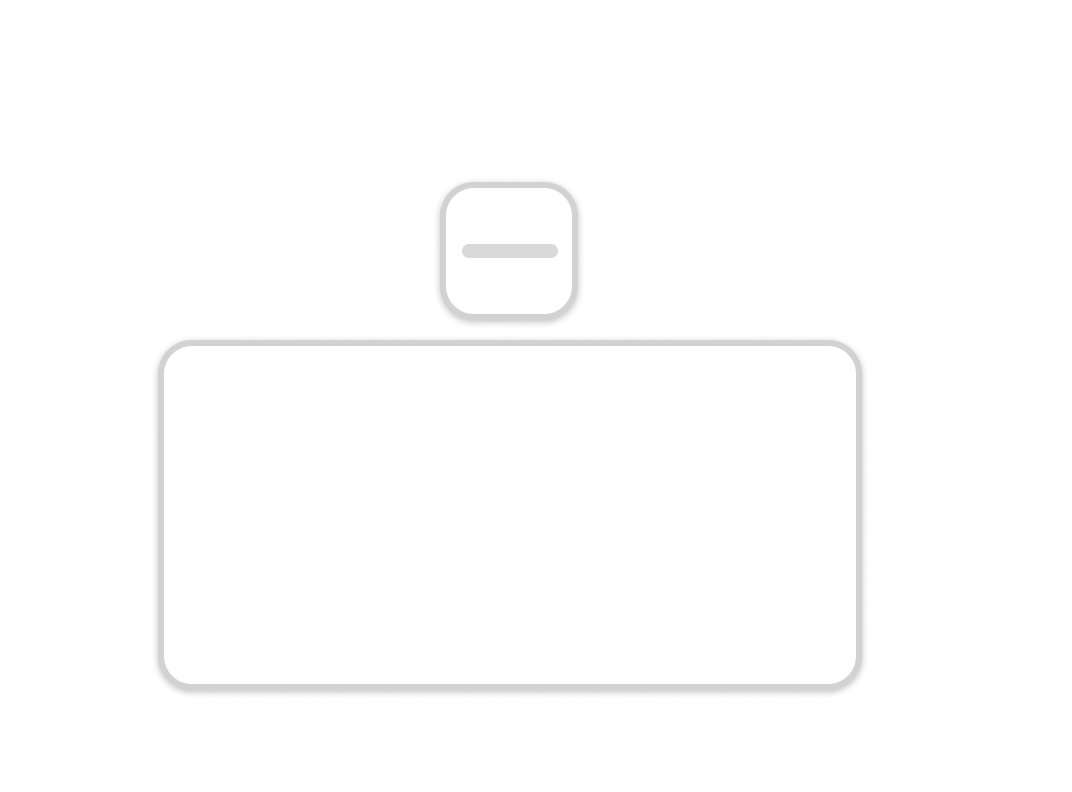
Popover
A popover is a floating panel that displays content over other page elements.

Select
Native select dropdown with custom styling.

Separator
Visually or semantically separates content.

Skeleton
Use to show a placeholder while content is loading.

Spinner
An animated loading indicator.

Switch
A toggle switch component for binary on/off states.
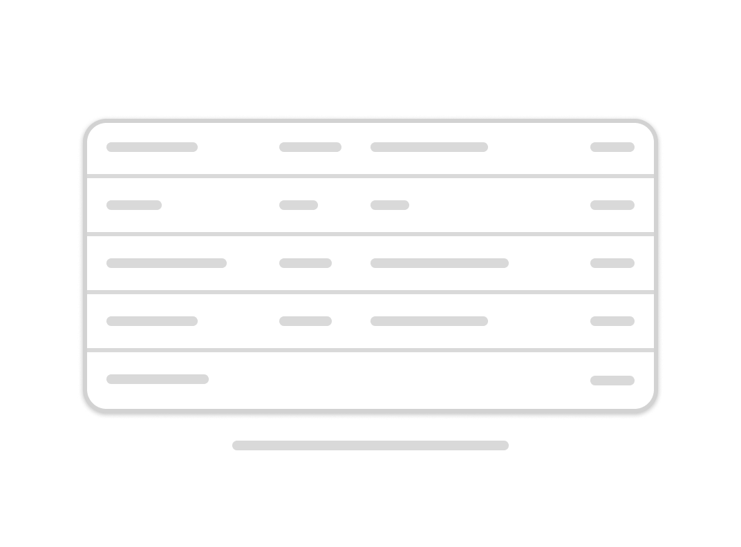
Table
A responsive table component for displaying tabular data with support for headers, footers, and captions.
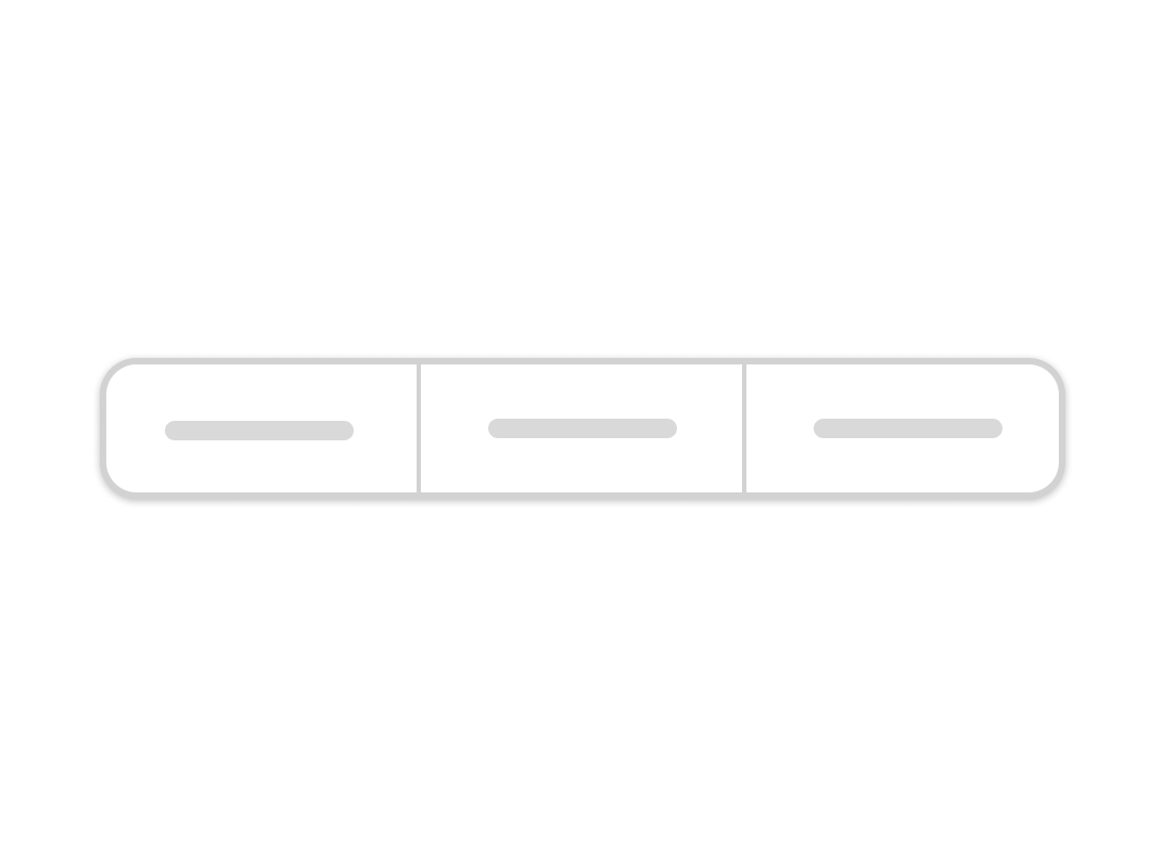
Tabs
A set of layered sections of content—known as tab panels—that are displayed one at a time.

Textarea
Multi-line text input field with validation states and focus styling.
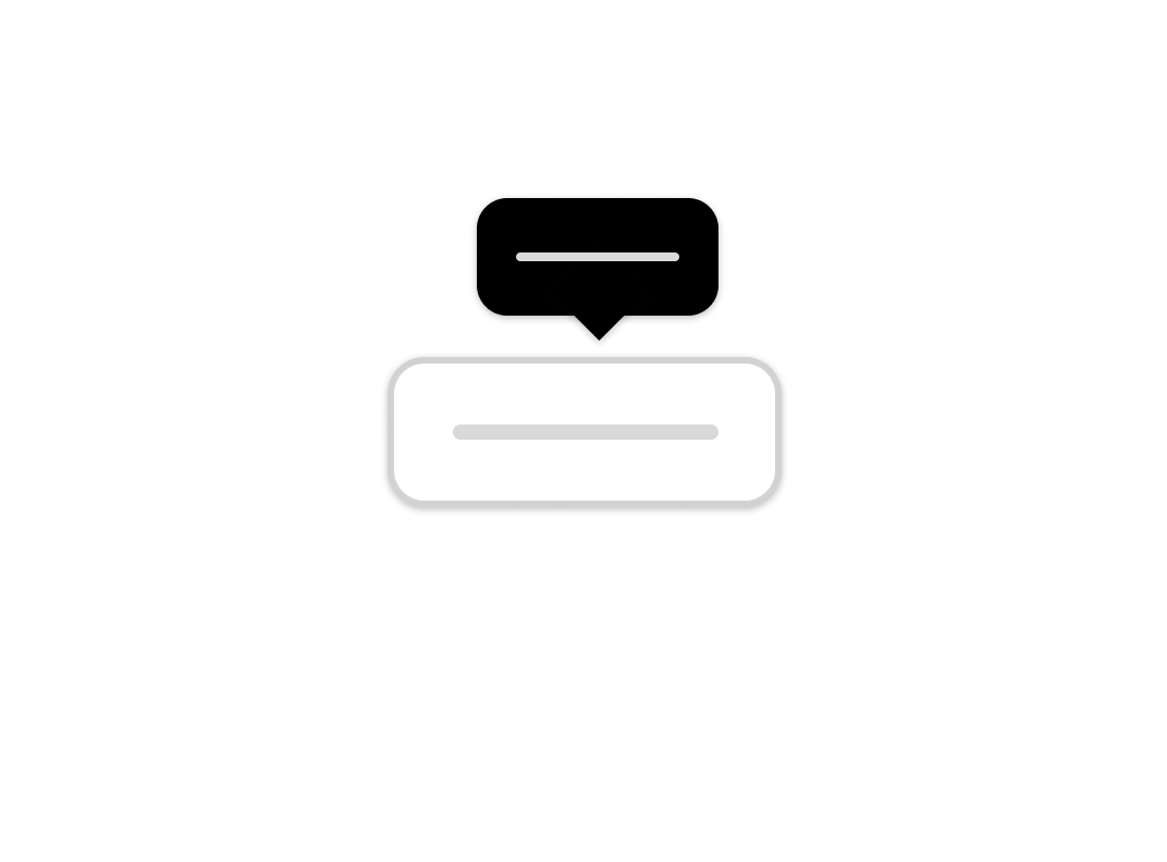
Tooltip
A tooltip is a floating panel that displays helpful information when users hover over or focus on an element.